Responsive Products Page – online ecommerce store part 1
In our previous demo session Pagination And Filter e-Commerce Angular App | mat-table we have covered filtering and pagination functionality in our ecommerce online store. Now we will focus on adding functionality of AddCart where we can add/delete items or change its quantity in our Products page.
In this video session Responsive Products Page | e-Commerce | Angular Material | 1 we will see how to make responsive products page by using mat-table. Currently we are using mat-card or mat-grid and it looks like below:

In normal mode it is looking good, but in mobile mode all products are overlapping with each other. Let’s try to fix this first by adding required code in products.component.html file. Here also we can go to angular material site https://material.angular.io to get the mat-table code for required functionality and put it in products html file.
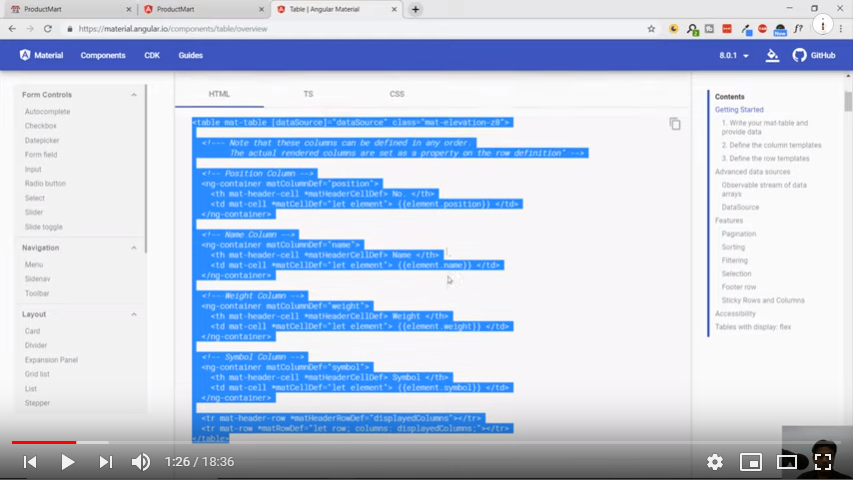

After placing the code and making required changes, still we can see our products are not displaying at all. Reason is we do not have any data source and also have not defined displayed columns. For this first we need to create products.ts file by creating a class in core module and define some properties inside it.
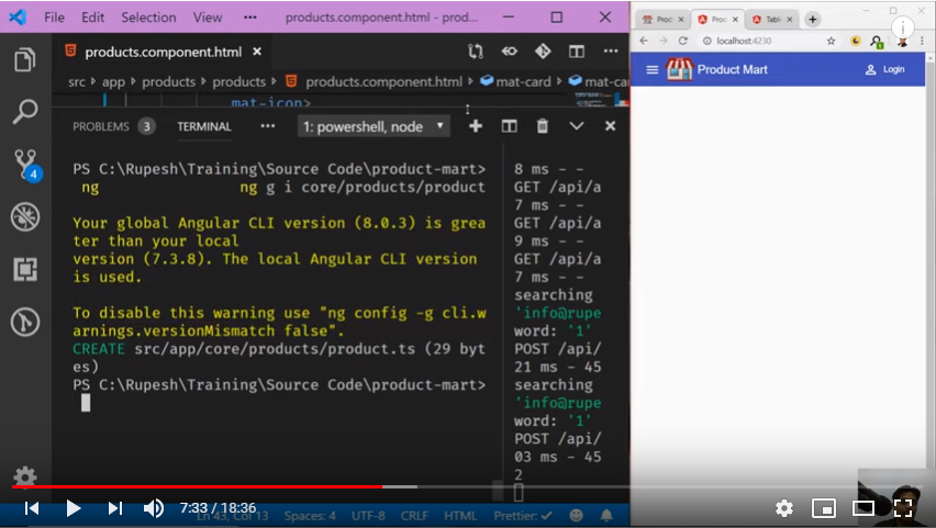
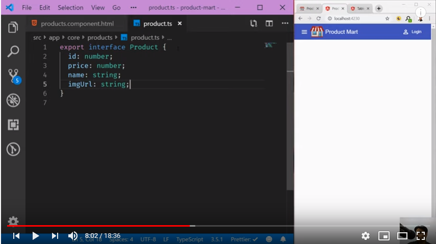
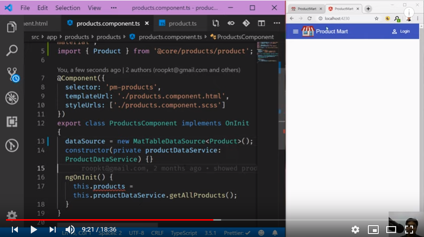
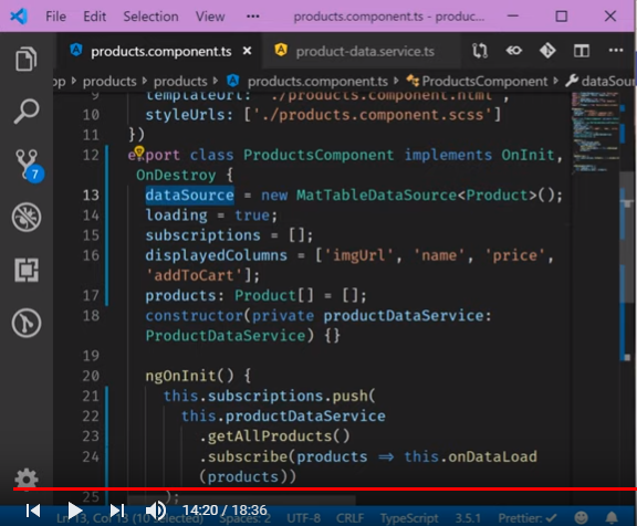
Second thing we need to define the data source in product.component.ts file as shown below, currently it’s just an observable of any. Along with this we will also define properties loading, subscriptions and displayed columns in it.
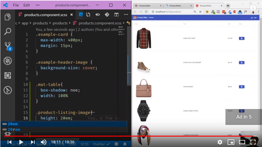
At last we will do some css settings to look these products page better as shown below:
In next video session Responsive Products Page | e-Commerce | Angular Material | 2 we will focus mainly on the responsive part of our products page.


Comments