Responsive Toolbar - Online ecommerce Store Part 2
In continuity to our previous demo session Responsive Toolbar Online eCommerce Store Part 1 where we made required changes to our ecommerce store to make its toolbar responsive, in this demo session Responsive Toolbar Online eCommerce Store Part 2 we will take care of UI changes to make our web app toolbar look better as well as responsive.
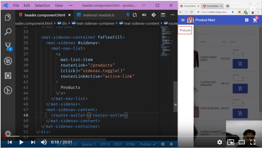
After making required code changes in header.component.html, when we tried to see its output it ended up in error.
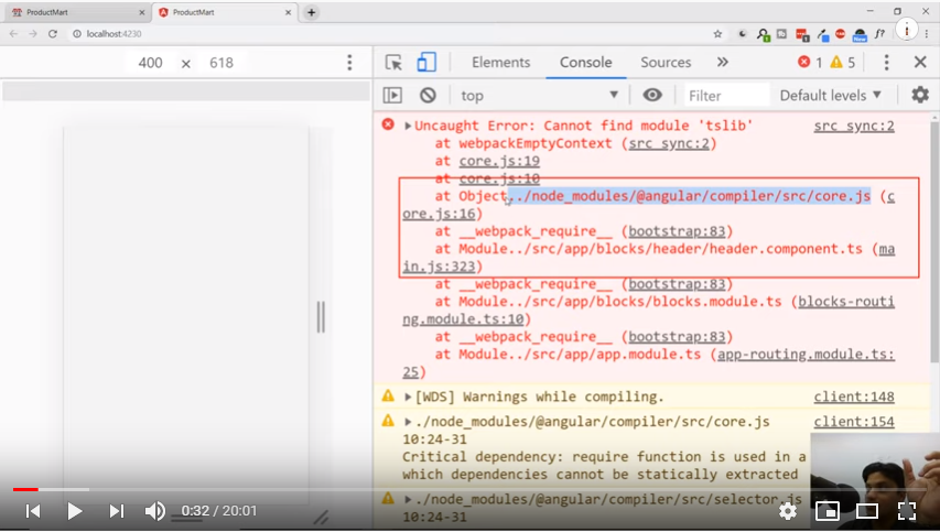
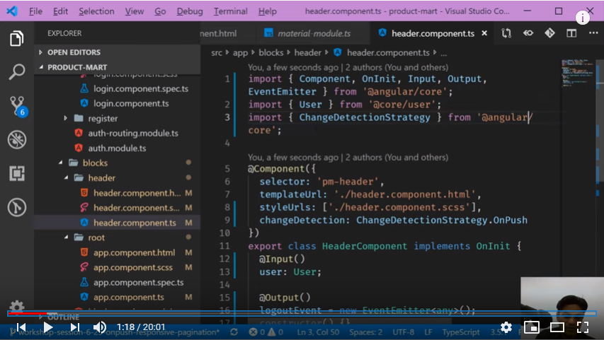
This error says it’s trying to pull some of the symbols, class names from wrong namespace. In this case simply we need to go to that component here its header component and make sure we are mentioning correct path there.
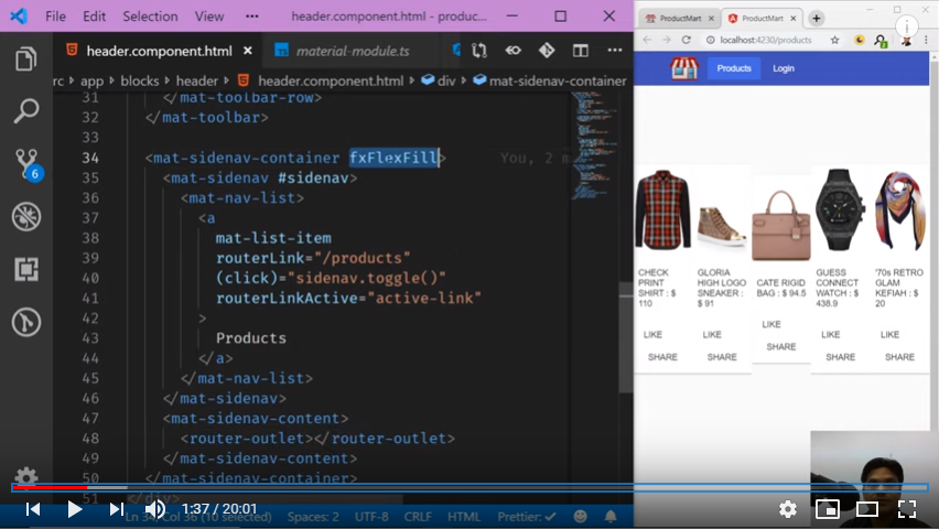
After rectifying this error we can see most of the things from design perspective are aligned, still lot more to do on this. Captured screenshot from our session shown below:
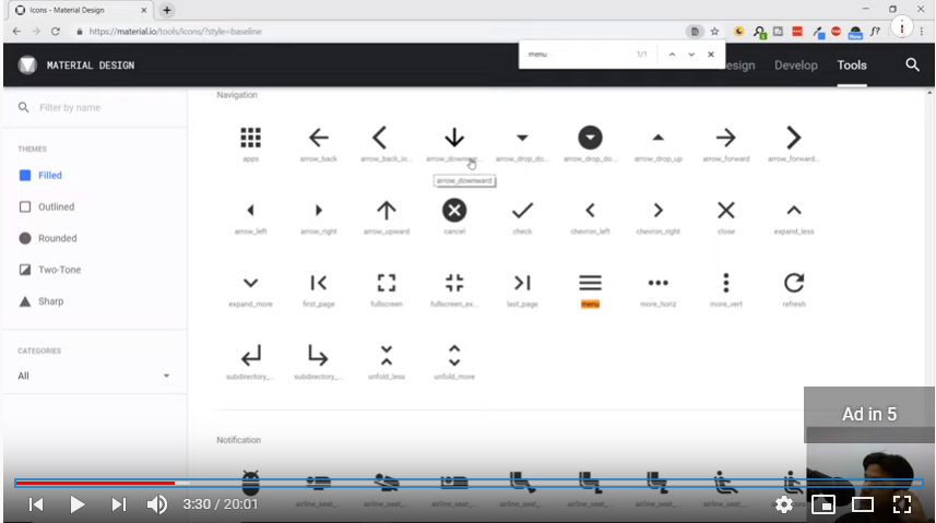
In order to look our app store more realistic, we need to put some meaningful icons. For this any time we can go to angular material site https://material.io and check required code to use like here we used menu bar.
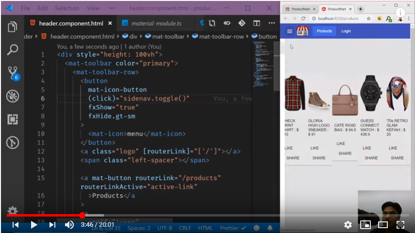
Next we will make other important changes like
- To show our app name after logo.
- Remove product menu as its coming twice.
- Show log-in, log-out properly through fx layout.
This fx layout is very cool feature as we do not need to write any media query that we used to write initially.
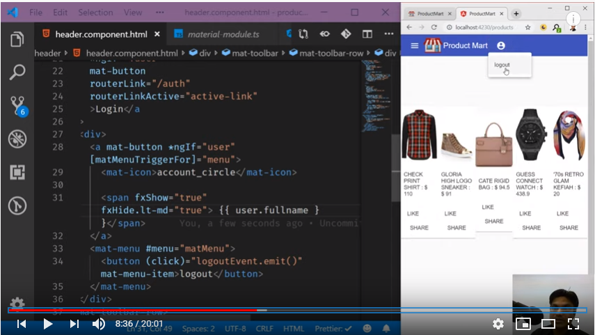
Also we should show these log-in/out icons on the right side and adjust margins on either side of logo and brand name.
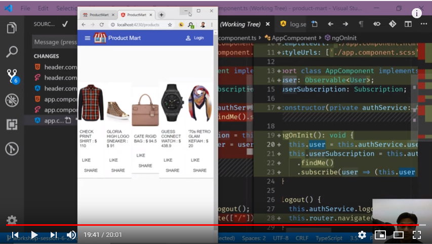
As we can see now our toolbar is looking quite realistic, next in our upcoming video session Creating Responsive Login And Register Page | Mobile Compatible we can fix the products UI as well and make it responsive.


Comments