Creating Mobile compatible Responsive Login and Register Page - Online ecommerce Store
In our previous demo session Responsive Toolbar Online ecommerce Store Part 2 we have learnt how to create responsive toolbar with proper design. Next in this video session we will focus on creating mobile compatible responsive login and register page in our ecommerce store web app.
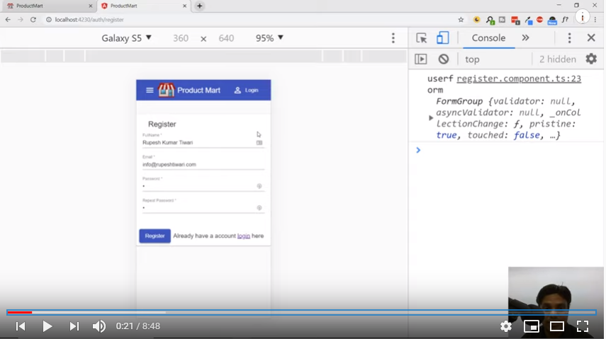
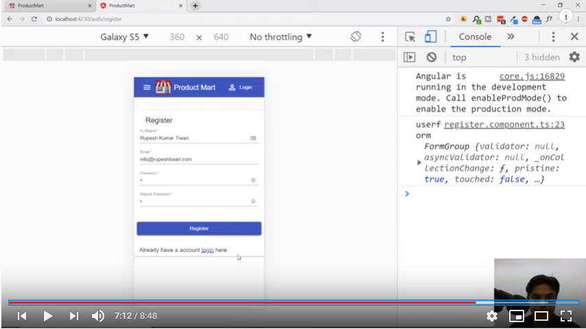
All this is explained in our demo session Creating Responsive Login And Register Page | Mobile Compatible in detail. Here we will go through each coding step one by one and briefly discuss with screenshots. Currently our ecommerce store looks like below in mobile:
Register page:
Login Page:
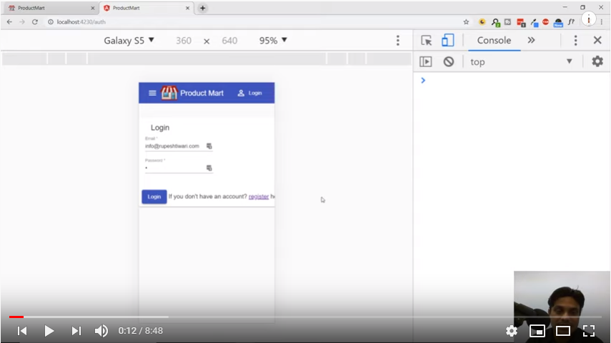
We can see register page text is coming properly, however in Login page message after login button is cutting. Also user data entry field are not properly aligned. Let’s start with login component first and make it responsive and look better. On comparison with Register page we noticed we have not applied full width in login component.
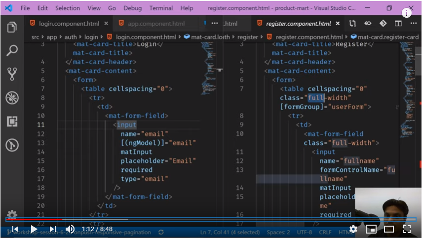
In order to make this change, first we need to make css part of login component in sync with register page and then we need to apply full width to our form fields as shown below:
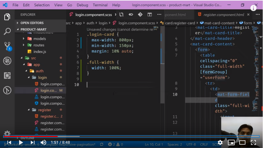
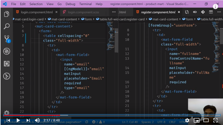
Now if we check our Login page, it will display similar to Register page of our ecommerce store.
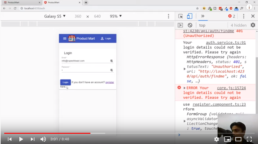
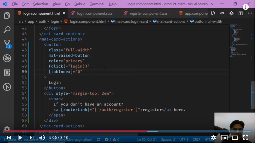
Next we need to put Login button and text message in separate div so that it looks nice in mobile display. Also if you see our login button is not responsive, we need to make it responsive so that on pressing, it take user to home page.
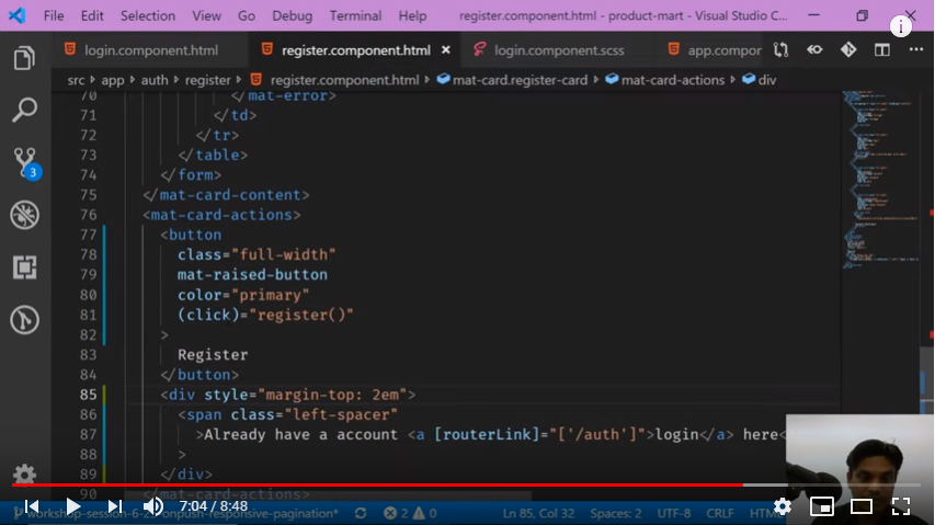
Similar changes we need to make in Register page, especially on its Register button, text message design and its responsiveness.
Since our Login & register pages are now properly aligned and made responsive, next in our upcoming video Pagination And Filter e-Commerce Angular App | mat-table we will focus on products page.


Comments